
|
|
||||||||||||||||||||
|
|
|
|
||||||||||||||||||
|
|
||||||||||||||||||||
|
|
|
|
|
|
|
|
|
|
||||||||||||
|
|
|
|
|
|
|
|
|
|||||||||||||
|
|
||||||||||||||||||||
|
#1
 09-15-2010, 11:30 PM
|
||||
|
||||
|
My first billboard
Been working on one for the last week and it's off to the printers.
It'll be quite weird seeing something I made blown up to a big assed size (more of a noticeboard size not one of the HUGE ones but big enough). Will post a pic when it's all done :D 
|
|
#3
09-16-2010, 01:04 AM
|
||||
|
||||
|
Congrats, mate! Hope to see it soon here.:)
__________________
@Letterboxd
|
|
#4
09-16-2010, 03:45 PM
|
||||
|
||||
|
Quote:
|
|
#5
09-16-2010, 10:28 PM
|
||||
|
||||
|
I think when you get into the 'visual mode' you consider thewords and blocks of text just to be shapes to balanced on the image and you play less attention to how they're actually made up...
Have you heard of Jan Tschichold? He's a famous typographer/designer. He does amazing stuff..(I think this is a homage to his style): 
|
|
#6
09-17-2010, 03:08 PM
|
||||
|
||||
|
Quote:
Jan Tschichold's stuff is great really stylish and shows you don't need loud fonts to create something interesting.
|
|
#7
09-18-2010, 02:50 AM
|
||||
|
||||
|
I was designing some stuff for a organisation in Wales (which was government funded) - this meant I had to do a version in English and Welsh. All the Welsh text was about 150% longer because of the backwards ass way the sentances are structured.
It was a nightmare (though it turned out ok in the end) - I most post a few of my bits and pieces at some stage..
|
|
#9
09-18-2010, 05:07 PM
|
||||
|
||||
|
It's for a childcare center(s)
Quote:
|
|
#10
09-19-2010, 11:29 AM
|
||||
|
||||
|
Here's part of a campaign I did for an org called UNO. Basically they organised volunteer workplacement in 3rd world countries..
Heres the postcards I did for them (they had to be duotone process - ie black and one other colour): 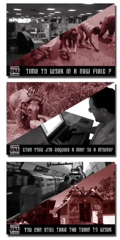 Here's a competition piece I did for some enviromental campaign about getting rid of your gum...I got into the final choices but didn't win...Did is the poster: 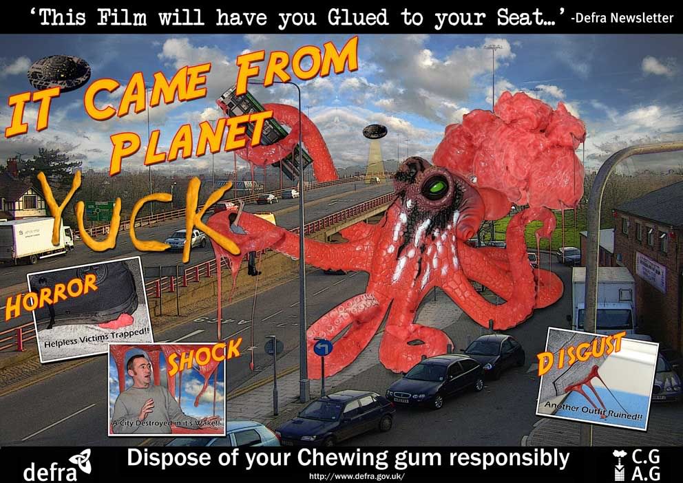 I took photos of real chewing gum for the textures...Man i had to chew so much of that crap..It turns my stomach to think of it.. This a schematic for thes gum caddy thing I bmade. Basically it had a paper despencer on it that u put your gum in... 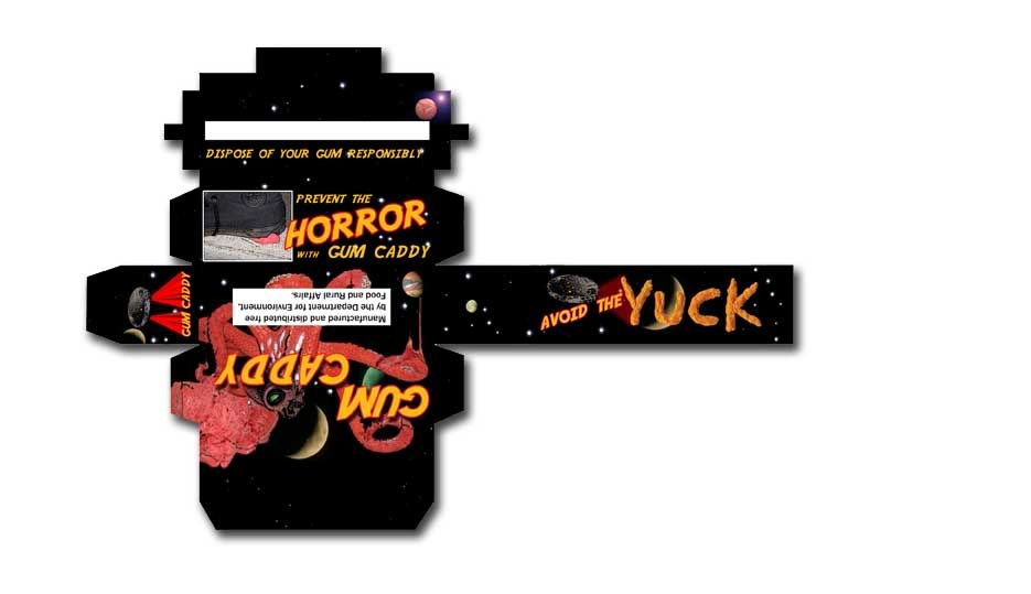 This is stuff I did in college (though the UNO project was used by them) - They look a little weak now, though I do thing the post cards were good in concept if not execution.. I'm not mad about uploading/showing my paid work and Design work from my last job (too many assholes on the net who will fuck with your real life) Last edited by Ferox13; 09-19-2010 at 11:33 AM.
|
 |
|
|